
How to use Google Charts API with 6 examples
Google Image Charts (ie. the examples provided in this post) has been deprecated as of April 2012. You should be using the new Google Charts instead.
Few months ago I had a good look into Google Charts API and it was great! If you are not aware, Google Charts API basically allows you to create pretty graphs simply by using an URL with correct parameters specified. It is fairly flexible, with many things you can change and customise - which is where it becomes bit complicated. It is quite easy to generate a chart, but it wasn't as easy to generate the exact chart I needed. So below are 6 examples charts with explanations and tips that will hopefully help you understand Google Charts better.
A few notes before I start
- The data/labels for all the graphs here have no meaning at all - just examples that I have come up with.
- I'll explain each parameter probably only once (since they are generally the same across all graphs). If something is different or special I'll explain it again.
- If you have any other tips/hints please share :)
Tip 0 (yes a tip before examples!) Use this tutorial with Google's own Developer's Guide. Google's guide is quite good, but just confusing at times. I won't be going through every little bit since Google's guide outlines a fair bit, especially the technical syntax.
Example 1: Pie Chart
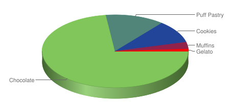
http://chart.apis.google.com/chart?
cht=p3&chs=450x200&chd=t:73,13,10,3,1&
chco=80C65A,224499,FF0000&
chl=Chocolate|Puff+Pastry|Cookies|Muffins|Gelato
There are 3 parameters that ALL charts MUST have, and they are cht, chs, chd.
- Chart Type (cht): Specifies the type of graph you have (pie, vertical bar etc)
- Chart Size (chs): Specifies the pixel dimensions of your graph (width*height)
- Chart Data (chd): The data that you want to display in your chart
1. Chart Type (cht) is quite straight forward - select the chart type you want, and put in the corresponding code which can be found from Google's Developer's Guide.
2. Chart Size (chs) is a tad more complicated but not much more (just needs a bit of trial and error). You specify the size of your graph in pixels: chs=
Tip 1: Give a rough estimate, generate the graph then press 'ctrl+a'. This will highlight the graph boundary so now you can adjust the size accordingly.
Tip 2: For pie charts, a rule of thumb is: w=2.5h for 3D charts and w=2h for 2D charts.
3. Chart Data (chd) is probably the most complicated as each chart has a slightly different syntax for data (see below examples and Google's Developer's Guide). For pie charts you need to make sure that the sum of your data points is 100 - ie. calculate the percentages and use the percentages as your data points.
Now onto the optional parameters - ones that allow you to customise the look of your chart and make the look pretty :)
Chart Colour (chco) uses the Hex representation (RRGGBB) to specify the colour of your chart. What colour you pick is really up to you. For pie charts you can just put in one colour and all the segments will be shades of that colour. Or you can put in more and the segments will be a gradient from the first colour listed to the last colour listed.
Tip 3: If you have a fair few segments in your pie chart, I find listing 3 colours works well. It creates a relatively nice gradient and makes it easier to distinguish between the segments.
Chart Labels (chl) specifies the labels for your data. It is optional, but you probably want to include them, so your chart will makes sense! With pie chart, it makes sense that the number of segments you have is the number of labels. So if you had 6 bits of data, you'll have 6 labels. However, unlike chd where values are comma separated, pie chart labels are separated by a vertical bar '|'.
Tip 4: If you want a space in your labels use '+' where you needed spaces. eg. Puff+Pastry
Example 2: Horizontal Bar Chart
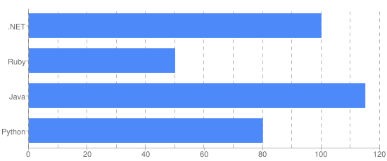
http://chart.apis.google.com/chart?
cht=bhg&chs=550x230&chd=t:100,50,115,80&
chxt=x,y&chxl=1:|Python|Java|Ruby|.NET&
chxr=0,0,120&chds=0,120&
chco=4D89F9&
chbh=35,0,15&
chg=8.33,0,5,5
Chart Axis Type (chxt) specifies the different axis that will be displayed on the chart. There are 4 types (x,y,t,b) and can be repeated (eg. you can have 2 x-axes). These axes are referenced by their index numer (that is the order you have specified them in). Counting starts at 0. So in the example, x-axis is #0, and y-axis is #1.
Chart Axis Label (chxl) specifies the label you want for the axis/axes. The syntax is generally quite straightforward with the axis number coming first followed by a colon':' and then the label names. There is just one small 'exception' (bug?) that I have discovered. For horizontal charts you need to "flip" the axis label and the data you provide. So if your data is chd=t:1,2,3,4 your axis label will have to be chxl=1:|Four|Three|Two|One. Again, this only happens for horizontal charts and I'm not quite sure why.
Not quite a tip: Just to re-iterate, for horizontal charts you need to "flip" (or reverse) the axis labels and data you provide for them to match. So the first label will match the last data, second label match the second last data etc. Note in the example, Python is the first label, but it has value 80 - the last data point. (Strangely enough, this doesn't happen for vertical charts)
Chart Axis Range (chxr) specifies the start/end range of the axis. The first number specifies the axis, second and third number specifies the start and end of the range respectively. In most cases, you will probably want your range to be slightly more than your maximum data value. (eg. in the above the maximum value is 115, so I have set the range to be between 0 and 120)
Chart Data Scale (chds) specifies how your data will be scaled. My general rule of thumb is unless you want to do some special scaling (eg. compare percentages of the values instead of showing the actual value) you will scale according to your range. Whatever you have set the min/max of your range (chxr) will be the min/max of your scale (chds).
In order to display your chart correctly, you will need to use both, Chart Axis Range (chxr) and Chart Data Scale (chds). By default the range and scale is 0,100 - but chances are you won't always want your axis to have a maximum of 100. Without correctly specifying these two parameters, your chart will still appear, but it will essentially be incorrect.
Tip 5: chxr and chds will generally be a pair and have the same values. The min/max specified in chxr will also be the min/max for chds.
Tip 6: If you want to display the data percentage-wise, the chxr and chds will differ. chxr will have range 0-100, and chds will be 0-max data point. For the example above, if the graph were to show the percentages of each bar the 4th line will be replaced with: chxr=0,0,100&chds=0,115&
Chart Bar Size (chbh) specifies the width of the bar and also the spacing between bars (and groups of bars). The first number (mandatory) specifies the width of the bar. The second and third are optional and they specify the spacing between bars in a group and between groups. In this example, the bars have width of 35, and each group (separated by commas in chd) is separated by width 15. As each group only has one data point, changing the middle value will make no difference (to have more than one data point for each group, you need to use vertical bars '|' - see examples below).
Chart Grid lines (chg) draws the lines behind the bars, making it easier to read the chart. Although optional, I think these really are the icing on the cake for the charts. The syntax chg=
Getting the grid lines to draw at the intervals you want (eg. every 10 units) is the tricky bit. Google by default assumes your axis range is 0-100 which isn't always the case, so some basic maths is needed. IF your axis was 0-100, then to have vertical grid lines every 10 units is simple: chg=10,0,5,5. But in the example the range is 0-120 so the grid lines will display incorrectly if you simply put in chg=10,0,5,5. To get the lines to show correctly for range 0-120, you need to 'scale' the grid line value. Luckily it is quite simple: 100/120*10 which gives you 8.333..., therefore chg=8.33,0,5,5. The formula is basically 100/MaxRange*IntervalAmount. Also, if the result is not a whole number, give the value to two decimal places, otherwise the grid lines will be slightly off.
Tip 7: To calculate the value to correctly draw your grid lines, use the formula: 100/MaxRange*IntervalAmount. eg. Your graph has range 0-80, and you want an horizontal grid lines every 5 units: 100/805=6.25, therefore you will have: chg=0,6.25,5,5
*Tip 8:** If the value calculated from the formula is not a whole number, go to two decimal places for more accurate grid lines. (You can go to three or more decimal places, but I find two is generally enough)
Example 3: Vertical Bar Chart
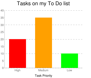
http://chart.apis.google.com/chart?
cht=bvg&chs=350x300&chd=t:20,35,10&
chxr=1,0,40&chds=0,40&
chco=ff0000|ffa000|00ff00&
chbh=65,0,35&
chxt=x,y,x&chxl=0:|High|Medium|Low|2:||Task+Priority||&chxs=2,000000,12&
chtt=Tasks+on+my+To+Do+list&chts=000000,20&
chg=0,25,5,5
Chart Colour (chco) is quite straight forward. Note that for this example, I have used the vertical bar '|' to separate the three hex colours in order to get different coloured bars. If I had used a comma ',' then all the bars will be red (the first colour).
Chart Axis Style (chxs) allows you to apply a style to your axis. chxt and chxl (explained in Example 2) specify which axis you want, and their labels while chxs lets you specify the font colour and size for a particular axis. In this example chxs=2,000000,12 has set axis #2 to be black with font size of 12. Note: If you look carefully you'll see something "strange" in the chxl for axis #2 (Task Priority axis). The empty '||' on either side of the label is so the label will be centred.
Tip 9: If you want a second x-axis for say an axis label you can centre the label by having empty labels '||' left and right of your actual label. The number of empty labels will depend on the number of categories in your main x-axis, and how long your axis label is. In this example, the axis label is quite short and there is a total of 3 categories (High, Medium, Low) so i have put one empty label on each side of 'Task Priority'
Chart Title (chtt) specifies the title of the graph. Like other labels, if you want a space in your title use the '+' character wherever you need a space.
Chart Title Style (chts) specifies the font colour and size of the title. It is quite similar to chxs.
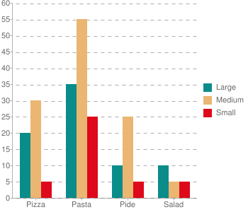
Example 4: Stacked Vertical Bar Chart
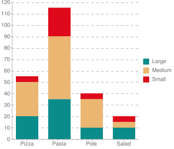
http://chart.apis.google.com/chart?
cht=bvs&chs=350x300&chd=t:20,35,10,5|30,55,25,0|5,25,5,5&
chxr=1,0,120&chds=0,120&
chco=0A8C8A,EBB671,DE091A&
chbh=45,20,15&
chxt=x,y&chxl=0:|Pizza|Pasta|Pide|Salad&
chdl=Large|Medium|Small&
chg=0,8.3,5,5
Chart Data (chd) as explained in Example 1 specifies the data in your chart. However, note how the data for this slightly more complicated graph is written - it is separated using both commas and vertical bars. Each group separated by a vertical bar represents one series: the first group is Large, then Medium, then Small.
Chart Legend (chdl) specifies the legend for the chart. It is separated by vertical bars and corresponds directly to the way the data is represented.
Note that even though the largest individual data value is 55 (the 2nd value of group 2), the range/scale is put as 120 because the largest SUM of corresponding data values is 115 (sum of the 2nd values).
Tip 10: If you have a stacked chart, the range/scale will be the maximum of the sum of the corresponding values of each group. That is, compare the sum of all the first values in each group with the sum of the second, third values etc.
Example 5: Vertical Bar Chart
http://chart.apis.google.com/chart?
cht=bvg&chs=350x300&chd=t:20,35,10,10|30,55,25,5|5,25,5,5&
chxr=1,0,60&chds=0,60&
chco=0A8C8A,EBB671,DE091A&
chbh=15,0,20&
chxt=x,y&chxl=0:|Pizza|Pasta|Pide|Salad&
chdl=Large|Medium|Small&
chg=0,8.3,5,5
Data-wise, this chart is identical to Example 4a - the only difference is it is not a stacked chart (bvs), but just a standard vertical chart (bvg). The only changes are in the chxr, chds and chbh parameters to make the chart display nicely. Note how the range/scale is now 0-60, since it is no longer a stacked chart so the maximum value is 55.
Example 6: Line Chart
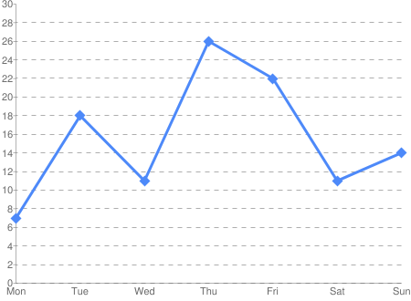
http://chart.apis.google.com/chart?
cht=lc&chs=450x330&chd=t:7,18,11,26,22,11,14&
chxr=1,0,30&chds=0,30&
chco=4d89f9&
chxt=x,y&chxl=0:|Mon|Tue|Wed|Thu|Fri|Sat|Sun&
chls=3,1,0&
chm=d,4d89f9,0,0,12,0|d,4d89f9,0,1,12,0|d,4d89f9,0,2,12,0|d,4d89f9,0,3,12,0|d,4d89f9,0,4,12,0|d,4d89f9,0,5,12,0|d,4d89f9,0,6,12,0&
chg=0,6.67,5,5
Chart Line Style (chls) specifies what the line will look like. The numbers are (in order) how thick the line will be, size of line segment and size of blank segment. So if you want a solid line (as per example) you will want the last value to be 0. Note, the line style is just the line - it does not draw the markers, that is specified in chm (see below).
Chart Markers (chm) specifies what the markers will be for each data point. Setting the markers is quite ugly - you need to specify the marker for each data point you have. Luckily, the syntax is relatively easy - the shape/type of marker, colour, data group, data point, priority. In this example there is only one data group (so the 3rd value are all zeroes) and you can see that the 4th value of each chm group goes up by 1 as it specifies the particular data point. The size is set to 12 to make the markers nice and big. Priority specifies how the markers are drawn - below or above the line and other markers.
Wow, so that finally concludes this tutorial which turned out much longer than I had imagined! Hopefully I've made sense, explained things well and helped you get a better understanding of how to use Google Charts API to get the charts you want/need. If you have any questions please feel free to ask, or if you have some tips please share them :)