
Sandbox: CSS transforms and animations
You are now reading the first of my "Sandbox" posts :)
The idea of this "Sandbox" is that there are so many cool things on the web that I keep seeing and wanting to learn/try out. I'm very much a hands-on learning person, so the sandbox is going to be a collection of my random explorations of things that have caught my attention. Hopefully I'll be able to regularly update the sandbox!
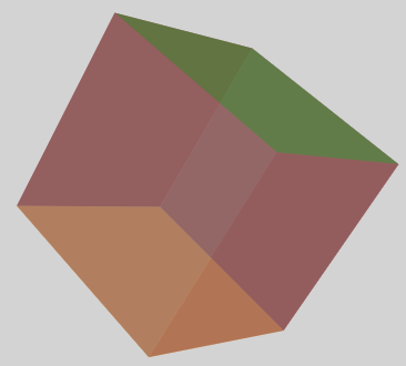
The first thing to go into my sandbox is an exploration of CSS transforms and animations. On Thursday, I went to "What do you know?" (it's awesome!) and listened to Patrick talked about "Moving to a 3D web with CSS", in which he showed us how easy it was to make a cube using CSS.
Been meaning to look into CSS transforms for a long time, so this was a sign! Thus I spent most of my Saturday hacking at CSS :) For the impatient, here's the source code (under 2012-08-18).
Here are two tutorials that I found extremely helpful when poking around with the CSS:
- Keyframe Animation Syntax
- The Guide To CSS Animation: Principles and Examples (used this as a tutorial for the bounce example)
The above two links will give you a good start on your CSS animation journey, so instead of writing a tutorial, I'm going to highlight some "gotchas" that I hit yesterday.
Animation is cool - but you have to define it!
When you see something like this:
-webkit-animation: spin 8s infinite linear;
Don't be tricked! The "spin" is actually not a built-in animation, you have to define it yourself. At first, it might seem like more work, but it's quite simple and it also means you can specify how the animation works. For example, here is my 'spin' definition:
@-webkit-keyframes spin {
  from { -webkit-transform: rotateY(0) rotateX(0); }
  to { -webkit-transform: rotateY(360deg) rotateX(360deg); }
}
I've decided to rotate on both the X and Y axis to make the rotation more interesting. The syntax is fairly simple (but powerful) once you get the hang of it. For a detailed explanation of the syntax have a look at: Keyframe Animation Syntax
Required properties
Now I could be wrong here (please correct me if I'm wrong!), but at least from my experience so far it appears that you need these two properties for things to work:
position: absolute; Seems to be needed for both 2D and 3D animations, otherwise the transforms don't seem to have something to 'anchor' to.
-webkit-transform-style: preserve-3d; Needed for 3D animations if you want your shape to keep it's 3D-ness when it's being transformed/animated
The axes rotate with the element when you transform it
By default, if you are looking at a webpage, the x-axis is the horizontal axis, the y-axis is the vertical axis and the z-axis the one coming out of the screen. The origin is the -webkit-transform-origin of the element, and like the cartesian plane, right is positive x, up is positive y, and out of the screen towards you is positive z.
Now, when you transform your element, the axes for that element rotates with it - that is, each element has it's own set of axes. So, if you rotate an element 90deg by the x-axis -webkit-transform: rotateX(90deg), the positive y-axis is now pointing out behind the screen (away from you) and the z-axis is now what the y-axis used to be.
Each element can only have one transform property
A transform property for an element, looks something like this:
-webkit-transform: rotateX(90deg) translateZ(100px);
Now, if you apply another transform to this element (maybe via animation) that new transform property will override the initial property. It is quite annoying that you can't stack the transform properties, but the 'transform' property is actually a single property (and not shorthand) so you can't specify to change just one type of transform.
This means, if you want a more complicated animation, you will need to wrap the element in a div and animate both the inner and outer div. This can cause your HTML to become quite ugly, but can't see a way around this.
Upgrade your browsers!
I did all my development using Chrome, and after everything was working, added the -moz versions to the CSS, opened it in Firefox and the cube didn't rotate! After spending some 15min of debugging, realised I was using an old-ish version of Firefox (version 8). Upgraded to version 12 and the cube magically rotates :)
That's all I've got for now, hopefully it has been helpful and/or made you want to go and try some CSS for yourself. If you missed it, you can see the code here (under 2012-08-18).